Hedyn.net has a new skin, Pivot, mainly because it has a responsive design and the previous one, Vector, does not. In other words it responds to screen sizes from laptop/desktop down to the smallest mobile phone.
I’m not sure why Wikipedia still runs Vector and continues to offer separate mobile and desktop versions. That’s another story.
If you want to check if a website design is responsive, just visit from a phone or tablet and compare it to laptop. Alternatively change the shape and size of the browser on your laptop and watch what happens..
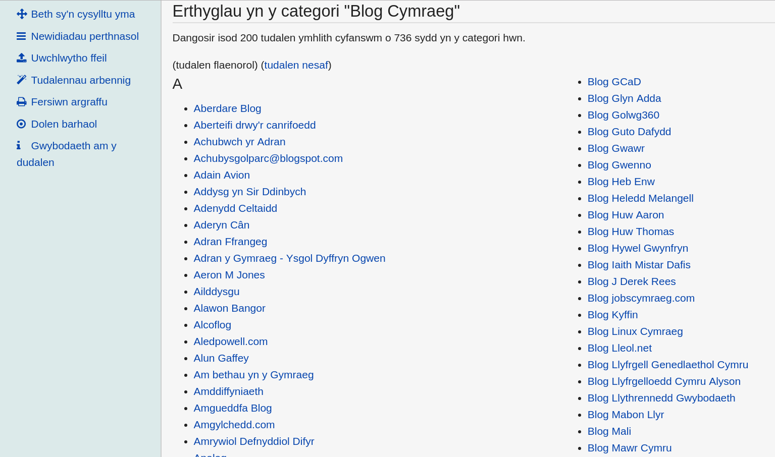
Hedyn.net is a wici which has been running continuously for nine years to provide a knowledge base for Welsh-language web resources, e.g. a list of blogs in Welsh, ideas and planning for Hacio’r Iaith unconference events, and WordPress resources for website developers.
I visit Hedyn.net several times each week to access resources and look things up. Contributions are always welcome in the form of edits. I’m also trying to do more notetaking there as public-by-default, especially things which have no need to be kept private.