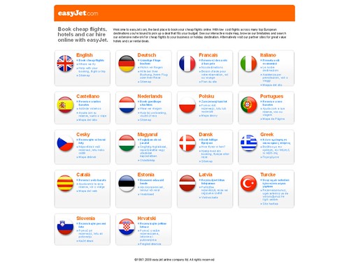
Easyjet have recently changed their website. Now you get a language selection screen. So far so good I guess (for a website).
But unfortunately instead of just the names of languages, there are flags as well.
The flags on this page may look colourful, but having them there is WRONG.
I’m not being pedantic here. It is simply wrong.
If you don’t get the flag screen when you visit easyjet.com and you want to see it, it may be because of your browser’s language setting. (In Firefox for instance, go to Tools | Options | Content | Languages.)
Failing that, look for and delete a browser cookie that stores Easyjet’s language setting. (In Firefox for instance, go to Tools | Options | Privacy | Show Cookies then search for “easyjet”.)
Here’s a slightly dated but classic web page about flags and languages (summary: don’t).
I’m not going to point out every case of this, but when a big company does it then it’s closer to becoming a de facto standard. It has an influence on other people and companies. This isn’t a particular beef with Easyjet, it’s just a clear example of this problem. My patience here is flagging. Etc.
